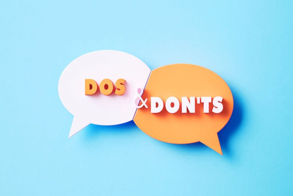
When it comes to creating a brand logo, there are certain dos and don’ts that can make all the difference in the success of your branding efforts. A logo is a visual representation of your brand, and it is often the first thing that people see when they encounter your brand. As such, it is essential that your logo accurately represents your brand and helps to create a strong brand identity. In this article, we will explore some of the key dos and don’ts of creating a brand logo.
Dos:
- Do Make sure that your logo accurately represents your brand: Your logo should be a visual representation of your brand’s personality, values, and overall message. It should accurately convey the essence of your brand and help to create a strong brand identity.
- Do keep it simple: A simple logo is often the most effective. Your logo should be easy to recognize and remember, and it should be visually appealing without being too busy or cluttered.
- Do use appropriate colours: Colors can have a powerful impact on how people perceive your brand, so it is important to choose colours that are appropriate for your brand’s personality and values. For example, blue is often associated with trust and reliability, while red is associated with energy and passion.
- Do make it scalable: Your logo will be used in a variety of contexts, from small social media icons to large billboards. As such, it is important to create a logo that can be scaled up or down without losing its clarity or impact.
- Do test it: Before finalizing your logo, make sure to test it with your target audience. This can help you to ensure that your logo accurately represents your brand and resonates with your audience.
Don’ts:
- Don’t use clip art or stock images: Your logo should be unique to your brand, so it is important to avoid using clip art or stock images. This can make your logo look generic and unprofessional.
- Don’t use too many colors: While it is important to choose appropriate colors for your brand, using too many colors in your logo can make it look cluttered and confusing.
- Don’t be too trendy: While it can be tempting to follow the latest design trends, it is important to create a logo that will stand the test of time. A logo that is too trendy may quickly become outdated and need to be redesigned.
- Don’t use difficult-to-read fonts: Your logo should be easy to read and recognize, so it is important to choose a font that is clear and legible.
- Don’t be too complex: A complex logo can be difficult to recognize and remember, so it is important to keep your logo simple and easy to understand.
In conclusion, creating a brand logo is an important part of building a strong brand identity. By following these dos and don’ts, you can create a logo that accurately represents your brand, resonates with your target audience, and helps to create a strong brand identity that will stand the test of time.
